Have you ever clicked on an online advertisement to learn more about how their product or service can help you, only to find the content on the landing page was misaligned from what was originally advertised, or to have the content be so cluttered and unorganized that you didn’t even know where to go next?
You just experienced a bad landing page.
Landing pages are often a customer’s first impression of your company or product, and are created specifically for the purposes of a content marketing or advertising campaign. If your landing page is not well-designed, or does not use its resources economically nor have a clear message, you are potentially losing out on additional sales.
Your landing page ideally provides information about how your product can help the customer and leads them to click a specific link, typically referred to as a “Call-to-action” button, or CTA for short. We will touch more on the importance of CTAs later in this article.
This article will also look at actionable tips for creating landing pages that are optimized for capturing leads and generating sales. Tips will cover both graphical and technical on-page elements that can have a direct effect on converting traffic into revenue for your business.
Tip #1 – Keep your content consistent with your target audience
Ensure the content on your landing page reflects the needs and concerns of your audience and how your product or service addresses those concerns.
Don’t forget to strive for consistency throughout your messaging as to not lose reader interest. If the description within a PPC ad is different from the messaging on the landing page, more than likely the visitor will abandon your site and may develop an unfavorable perception of your brand.
Tip #2 – Don’t underestimate the power of color & contrast
Colors can have a profound impact on how we perceive the world around us, and the same is true when perceiving a brand and their message. While red and yellow convey hunger and speed, blue and green convey calmness and the environment. And while bright, flashy colors might be appropriate for a flyer for a contest or party event, pastel or soft colors would be more appropriate for a brochure about Leukemia.
In addition to colors conveying different thoughts and emotions, contrast can be used to direct visitors to specific portions of your page. Typically you will want to use contrast to direct users to the portions of your landing page that have the highest chance of converting a visitor into a customer, like a CTA Button or a web form.
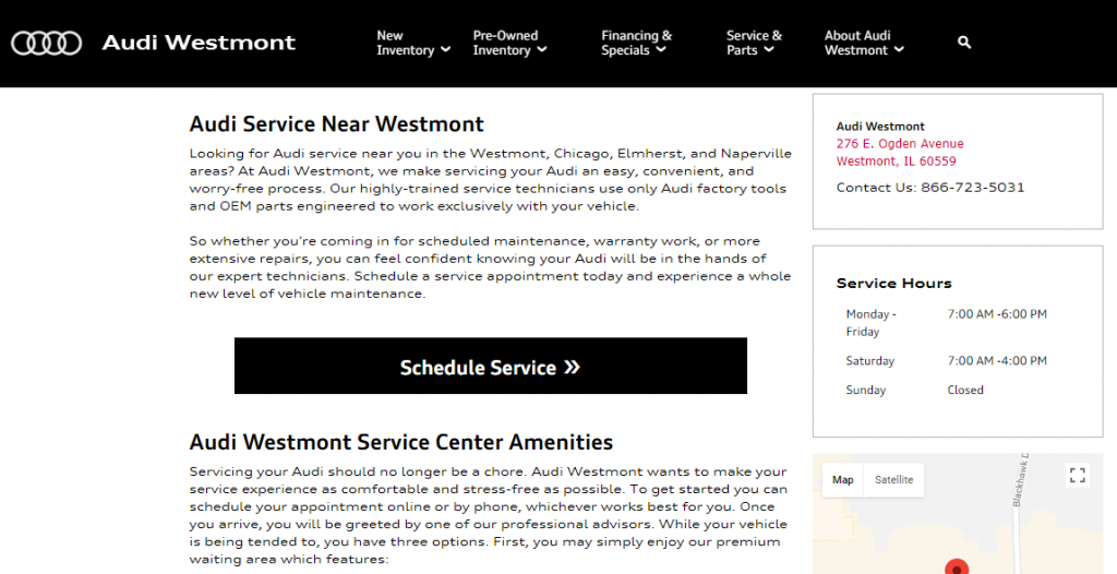
The following Audi dealership page, is the perfect example of leveraging contrast alone to make your call-to-action stand out:
You can use A/B testing, discussed below, to test which colors on your landing page your customers respond to best and which convey the image your company is trying to project.
Tip #3 – Minimize length of form submissions
How many times have you looked at a form to sign up for an eBook or a free trial and thought, this is too much and abandoned the page?
Forms that ask too many questions, while useful for your business, can turn away potential new customers who are already reluctant to give out their personal information. Forms designed to bring in new leads should be minimal as possible in design. Ask only for the information that is necessary. Often just their name and email address is enough. If you are offering services for a particular issue, include one or two basic questions about their situation.
For example: The form shown below has only three required fields, plus additional contact options for the reader. This is an exemplary page because of its simplicity and clarity.
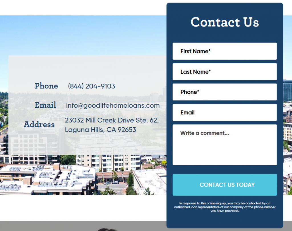
In short, save the long forms for customers who are already committed to using your product or service and trust you with their information.
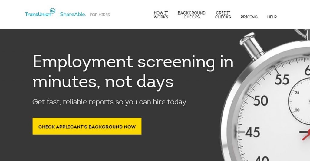
Tip #4 – Understand the importance of language and psychology
When designing your landing pages, you want to speak your customer’s language, i.e. how do they talk about their needs and concerns when searching for a product? How does your product address those concerns? It’s you duty to make sure you create a landing page that clearly addresses the concerns of your audience and presents them with a relevant solution.
For example, utilizing button text that states something related to your page, such as “click here to get your free eBook”, can be much more effective than simply “Submit” or “Download,” which will submit the customer’s information to you and download your content to them but doesn’t tell the customer the value for them in doing so.
Notice in the following example, how the CTA button reads “Check Applicant’s Background Now”, which directly addresses the users intent:
Tip #5 – Leverage sign-up/subscriber incentives
Sometimes you have to give a little to get more. Today, most people are reluctant to give out their personal information online. By leveraging an added incentive to your landing page offer, you provide users with an added benefit for completing your CTA, and can greatly improve the page’s conversion rate.
Some common types of incentives are:
- PDF whitepaper downloads
- e-books
- discounts on other products
- giveaways
- webinars
- product trials
Tip #6 – Treat your landing page as an evolving element of your site
Creating an effective landing page takes time. You should put as much effort into creating your landing page as you do for the rest of your site.
A/B testing is one of the most useful tools for optimizing your landing pages and improving upon conversion rates. Essentially, A/B testing helps you examine what is and isn’t working on your site, and what are the most effective solutions for improving your page.
A/B testing works exactly the way that it reads. You typically will want to focus on one specific element of the page, take the header for example. Then create two versions of the same page, with the duplicate page containing a modified version of the header. From there, you will direct one half of your traffic to page A and the other half to page B. During this split, you can compare the performance of each page to determine which produces the best results.
Hubspot has put together a great guide on how to conduct an A/B test and is great starting point for beginners.
Conclusion
A well-designed landing page can certainly make a positive impact on your ability to generate sales. By maintaining a clear and consistent message that speaks to the needs of your customers, and designing your landing pages to address these needs, you are more likely to convert a unique visitor into your latest customer.
However, creating an effective landing page takes both time and effort. Remember not to treat your landing pages as static objects and to continue testing new ways in which to improve upon the design and messaging of your landers. Hopefully by utilizing the tips outlined in this article you will learn more of what works and what doesn’t work during your next marketing campaign.

")
")
")

Comments are closed.